Hometaste

Simplify the meal preparation process for those who want to cook their hometown dishes in the U.S.
Project Lead of the Design Competition
Product Designer/ 2 weeks
UX Research, UX Design, Interaction Design
Figma, Adobe Illustrator, Adobe Photoshop
The cover video for Movin' app
The HypothesisResearch & InsightsProduct DesignIterationFinal DesignReflection
Our Hypothesis
It seems so hard to cook food from a different country

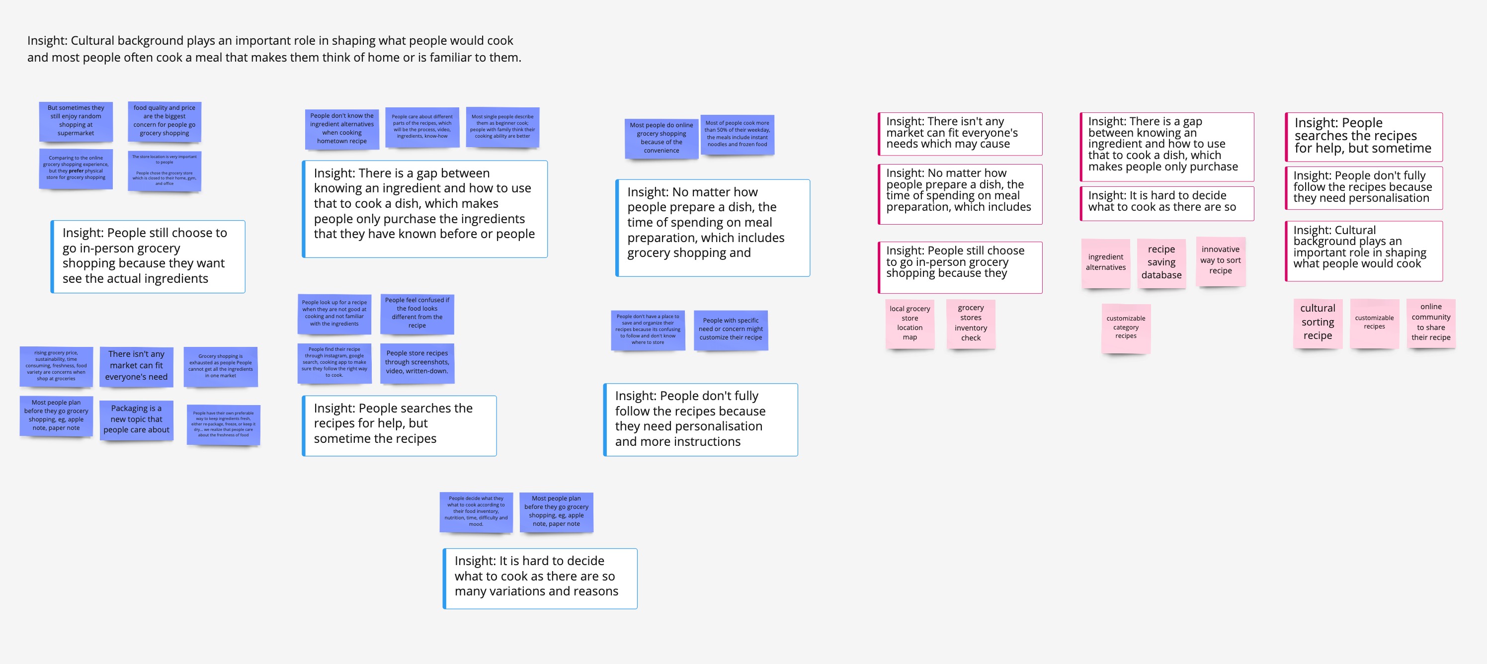
Food is life. Food is culture. Food is home. It’s not until we’re away from home that we realize how important food means to our well-being. Although it brings a great deal of excitement when we try new food in a foreign country, we may easily start to miss the foods we know. Food has the power to cure us, but longing for the favorite cuisines can actually make us homesick. In the U.S. we call certain dishes “comfort food", which reflects the feelings of happiness, warmth, and satisfaction after we consume. Those dishes even remind us home and family.

The image for the Movin' problem

Following this, I was to lead the project alongside a team consisting of 2 product designers. The whole process took a ton of research, exploration, prototyping and testing within 2 weeks (Nov 26th to Dec 11th, 2022). With the initial present, we ended up with a web app that we could say set the foundations for making foreign people in the U.S. a must have cooking guide app. Here’s what it took to make it happen.

User Research
Gathering user pain points and insights
To really understand our users and how to best develop the product to shift its mental model, we needed to start talking to them and learn how they find their comfort food and cook hometown dishes in the U.S.

Myself and 2 other designers conducted 8 interviews, involving participants who are aged 21-40 and are not original from the United States. We found most people spend a majority of time trying to cook hometown related dishes more than three times a week at home. The aim of the interviews was to gather qualitative information on the behavioral traits of our user base when it came to cooking their hometown food, and their attitudes, perceptions and current use of recipes.
User research data for hometaste
This session was absolutely valuable to setting the path to designing a product that meets our audience’s needs. And here are the key findings that we found:

Cultural background plays an important role in shaping what people decide to cook and most people often cook a dish that makes them think of home or is familiar to them.

No matter how people prepare a dish, the preparation time of spending on a dish (includes grocery shopping and cooking) is people’s primary concern.

There is a gap between knowing an ingredient and how to use that to cook a hometown dish, which makes people only purchase the known ingredients.

The research data was represented visually to help create a clear and easily digestible image of our users. Using journey maps to provide the common scenarios and areas of influence outside of the interactions with our web app directly; mapping out the journey of our target audience while they shop — highlighting triggers, their feelings throughout, pain-points and areas of satisfaction.
persona for hometaste
user journey map for hometaste
Problem Statement
How might we help people who want to cook hometown dishes themselves seamlessly and efficiently?

Based on the insights we got, we dote-vote on the opportunity areas to further brainstorm ideas. The 3 key opportunities are: personalization in finding the hometown recipes, the efficiency of dish preparation, and bridging the gap between an unknown ingredient and known hometown recipe.

Ideation
Deciding on a minimum viable product
Discussion for the minimum product key features
To make sure we were building the right thing for our users and reducing risk, it was important that we focused on the sufficient features that would satisfy our early adopters. We focused on what exactly the core functionality of the web app should be and the problems it should solve in respect of the user and the business needs. These areas were:
1. Personalization in sorting the hometown recipes
People already know what dish they want to cook, but there isn't an efficient or customized way for them to search, sort, and find hometown recipes. Therefore, we includes the onboarding questions to help us generate the personalized content for our users.
2. Shorten the time people spend on dish preparation
People have preference in specific physical grocery stores, so we include the store location information help assist users plan their grocery shopping. We also advise people on how to cook efficiently by offering tips and tricks on managing ingredients.
3. Bridging the gap between an unknown ingredient and known hometown recipe
Instead of scanning and learning the ingredients at the grocery store, we also recommend the alternative ingredients that could help recreate a similar or more authentic taste for our users.
Design & validation
Our aim was always to validate ideas as fast as possible, so we visualize a functional map for the web app structure to outline all the content and services as the functions that we will provide to the users.
The functional map for the web app
From our research, we found the efficiency and personalization of the web app is very important for our target audience, often identifying themselves with specific areas of food they belong. Based on the information architecture we laid out, we started with sketching out the idea, then created a medium-fidelity wireframe with user flow to lay out the user's movement from entry point right through the final interaction before going through a high-fidelity prototype. At this stage, we want to fully understand how a user navigate through the web app and determine what needs to be done.
The sketch of prototype
the low-fi prototype screenshot
Iterate the web app before we go for final design
From the 3 usability testings, all feedback was captured, explored and prioritized. Overall, 80% of positive feedback and 20% of suggestions to the web app. We see our target audience really like our idea of exploring their hometown recipes and combing their grocery shopping experience with cooking. However, we need to emphasize the personalization more to optimize their efficiency.
-
Overview
Quotes
UX/UI Design
Overall, the images and UI design give user a clear sense on what to do with the web app and it intrigues users to click the recipes. But we need to improve the accessibility so best assist our users to click for next steps.
“The images are clear and looks delicious that I want to click through. I also like the color is not so strong that I can focus on the recipe.”
‍
“The size of (+/-) can be more significant. Also, the color of the button and sliding dot can be more robust.”
Navigation & Workflow
The IA and flows are intuitive to navigate, but we also need to consider more guidance for the first time users.
“It’s easy to find the menu and my shopping list.”

“I like the layout how recipes are displayed as the images and cultural categorized.”

“I need more guidelines on what the barcode is for and how to use it in the search bar”
Experience & Content
Most content help users know and understand the web app; however, we need to think through the sorting system to make it more standard.
“Features are informative and helpful for me.” 

“I think overall the information is comprehensive that it can help me cook well step-by-step."
‍
“I need to have the title for the shopping list, otherwise I don’t what each column stands for.”
Final Design
After the usability tests and getting the feedback from the 5 competition judges, we iterated the prototype to more focus on empathesize how foreigner shop groceries and cook in the United States. And we added 3 onboarding questions to users to help generate the personalized main page and recipe sorting.
Registration Page
Through 3 questions to generate the personalized page for user and understand user's habits in cooking. We want to make our user to feel easy while using our web app and actually assist them to be more efficient in preparing a dish. Most important of all, we aim to ease their homesick feelings of longing for the hometown cuisines.
The final design of registration
Carefully using the primary and secondary color
We don't want to stress our user through using the primary color all the way, but giving them a sense of ease by slight using secondary color. Through the clickable button, we also help user save them to customize the recipe guide. Our main goal is to get user's answers to create the main page, so we don't prompt them to answers a lot of questions or type in their answers.
Home Page
Recipe recommendations and local stores near you are customized to each user. If they don't want to spend much time on browsing recipes, they can easily do a quick search on what they're looking for.
Personalized home page to access the recipes and stores
By answering 3 questions, our user gets recipe recommendations sort based on the time they want to spend on cooking a dish, cooking levels, and their personal preferences on which cuisine. Moreover, we also include the local market that are near our user's current location or they can add their personal preferred store as well.
Keep all other services in one place (menu)
As a cooking guide, staying focus on the recipes is our top goal. Along user's journey to learn how to cook a hometown dish, they will also want to access all the interested recipes, shopping list, and ingredient info. Thus we keep all those information in menu so they can quickly get what they need by clicking menu instead of finding what they need on screen.
The final design of home page
Make the recipes easy to understand and apply
Not just the simple introduction for the recipe, we also have the translation function to help user get the content in their preferred language. Food should not limit our boundary of trying a new dish. We hope the image, instructions, and ingredients can help user know cooking a hometown dish is an accessible and enjoyable thing.
2 ways to explore the recipe
We understand some people prefer to watch instruction video, but there are a group of people prefer to see the text as some interviewees mentioned they don't like to pause the video all the time
Why including the convert unit?
Only three countries – the U.S., Liberia and Myanmar still stick to the imperial system, which means most foreign people who lives or travels in the U.S. are struggling with all the different units. Thus, we have a toggle to covert that and also help user to edit the servings they want to cook.
The final design of recipes and its instructions
Connect cooking with grocery shopping together
Address the insight of shorten the time on preparing a dish, we connect the recipe and purchasing ingredients together to simplify the grocery shopping time. Moreover, by turning on the ingredient alternatives, our user can easily substitute the ingredients they don't want and combine different dishes ingredients together.
Addressing what insight and problem?
One of the insights is that people still choose to go in-person grocery shopping because they want see the actual ingredients and brings new ideas of cooking. Thus, we need to finalize the shopping list for our user need to help them quickly hand in to the market.
Why designing an ingredient alternative?
"Recently I want to purchase the pig blood cake, but I am afraid i cannot deal with that ingredients and i give up purchasing that." — Interviewee. More so, we conclude an insight that there is a gap between knowing an ingredient and how to use that to cook a dish, which makes people only purchase the ingredients that they have known before. In this case, we want to encourage user to try alternatives and be able to cook their hometown flavors.
The final design of shopping list
Ingredient info and learning
We want to help user not only cook their hometown dishes, but also learn American local ingredients. No matter what cultures we belong to, there is something worth to try and learn.
The final design of ingredient info
Why designing an ingredient info on the cooking guide?
The insight: there is a gap between knowing an ingredient and how to use that to cook a dish, which makes people only purchase the ingredients that they have known before. We want to bridge that gap for users to try a new ingredient, but they get a chance to try it in their preferred way. ‍
Our personalized sorting system to help tailer the recipes
We know that cultural background plays an important role in shaping what people decide to cook and most people often cook a dish that makes them think of home or is familiar to them. Thus, we have the recipe recommendations that our user might like (based on their regional or cultural preferences) and another section that they can try other new dishes below.
Keep all other services in one place (menu) to a seamless guiding experience
Here to keep all the other services we offer in menu, one is keep our user focus on the recipes, two is make the overall experience all in one place. In every page, the user can customize their sorting if they found they want to see a different information order. Also, we allow user to import their own recipes into the saved recipes, so they can not only get the recipes on the web app quickly, but also found their seen recipes or other preferred recipes all in one place.
The final design of menus and other services
Icon for back to top
Reflection
⏰ Prioritize Tasks Help Efficiency
Giving the limited time of 2 weeks, it seemed impossible to conduct the UX research, design, testing, and iteration in this timeframe. However, I tried to document all the necessary tasks in the excel sheet to help prioritize the tasks. Also we need to coordinate well since we need to deal with 3 time zones. I definitely feel challenging to lead the other 2 designers who don't have much work experience, but it also gave me the chance to learn how to sharp my leadership skills. I tended to share what I like to do for each stages of research and design and understand what others' preferences; then, we discussed the most suitable way we all can work on.
🔍 Learn How to Deal with Abigity
People always say UX designer needs to deal with and be comfortable to work with ambiguity. But when things come with no directions and no clues, it did get anxiety easily. For the competition, there weren't a clear topic, grading criteria, strict requirements, myself and teammates fell into non-stop discussions to get progress on which directions or areas that we want to focus on. I see how communication is important to the UX design or group project because we can spark new ideas to each others.